Showing posts with label sponging technique. Show all posts

Sunday, February 3, 2013

More Swallowtail Cards

I really like this image but I promise to put it away after these cards.

The first card is again in my favorite color combination - blue and green!  The swallowtail was stamped in black pigment ink and heat embossed with clear embossing powder.  I colored the image with sponge using Island Indigo and Lucky Limeade inks.

The card base is Lucky Limeade.  I embossed the Island Indigo cardstock with the Swirly embossing folder, my very first embossing folder by Cuttlebug.  The sentiment was stamped in white pigment ink and heat embossed with white embossing powder then punched with the Petite Curly Label punch from Stampin'Up.  Love how this turned out.  The ribbon is 1/4" satin in Island Indigo.


The colors I used on this card are Raspberry Ripple and Summer Starfruit.  The image was also stamped in black pigment ink and heat embossed with clear embossing powder.  I used a blender pen to apply color to the image.  The ribbon is 3/8" stitched satin ribbon in Summer Starfruit.  The sentiment was stamped in black pigment ink.


Okay, that's all the swallowtail cards for now.

Thanks for stopping by today.

Cheers!!!

irene


All supplies used were from Stampin'Up except the embossing folder.

Wednesday, January 30, 2013

Swallowtail - Triple Time Stamping Part 2

I'm still playing with the Swallowtail stamp.  This time I got the standard measurements for the different panels.  It's fun picking color combinations to make the butterfly "flutter" on paper.

The picture instructions and measurements for this technique are towards the end of the post.  I'll start with the samples which were all stamped with black pigment ink and heat embossed with clear embossing powder.

The first card is one of my favorite color combinations - navy blue and bright green.  In Stampin'Up world those colors are called Night of Navy and Lucky Limeade.  The image was colored with Lucky Limeade, Marina Mist and Midnight Muse inks.  The background was sponged with Lucky Limeade and the background images were stamped in Marina Mist ink.  The sentiment was heat embossed in white embossing powder on Lucky Limeade card stock.


For the next card I used Rich Razzleberry card stock and Pool Party ink.  On this card, I sponged Pool Party ink all over the panels.  Easy peasy!  I stamped the sentiment with Rich Razzleberry ink and hand cut just the word Love.  It's hard to see on the picture but I also stamped hearts on the background using Pool Party ink.  I love these two color together.


And the last card was made with Cajun Craze card stock.  I colored the image with Daffodil Delight and Cajun Craze inks.  I stamped hearts and the word Love on the background with Daffodil Delight ink.


Now onto the instructions.  You will need three panels cut from light colored cardstock, white or ivory are ideal.  You will also need a base card and two mats cut from your choice of cardstock, pictured in green here.  My panel measurements are 5-1/4" x 4", 4-1/4" x 3" and 3-1/4" x 2".   My card is 11" x 4-1/4" folded in half.  The mat measurements are 4-1/2" x 3-1/4" and 3-1/2" x 2-1/4".  If your card is a different size, adjust your panel and mat measurements accordingly


Apply removable tape to the back of your panels and stack them evenly like the picture below.

Stamp your image or images onto the stacked panels.  Don't worry about the "break" between the panels, the mats will cover those.  Color your image, if needed, while the panels are still glued together.

Separate the panels and attached each panel to the base card and mats.  

Make sure your matted panels are oriented properly when you assemble them.  Your image or images should match seamlessly.

This was a fun and easy technique to do.  I'm glad I finally got around to trying it.

Hope my instructions are clear and you won't have trouble making your own card using this technique.

Thanks for stopping by today.

Cheers!!!

irene


All supplies used are from Stampin'Up.

Monday, January 28, 2013

Swallowtail Card - Triple Time Stamping Technique

I went through a phase where everything I made had butterflies on them.  As a result, I have all kinds of butterfly stamps, dies and punches.  I actually haven't touch any of them in like a year or so.  And then Stampin'Up came up with the Swallowtail stamp in their Spring catalog and I'm hooked all over again.

Last summer a technique called triple time stamping was so popular everyone was doing it.  I wanted to try it but the holidays rolled in so fast I never got around to doing one.  When I saw the Spring catalog preview, I knew the Swallowtail stamp is perfect for this technique (at least for me).

Once I started playing with it I couldn't stop.  These are the two samples I have for today.

The first one is a simple black and white with a pop of red.  I added a gray ribbon, too,


The second one is the triple time stamping technique.  I cut my card stock from memory and it turned out I was way off.  I did mine in a quarter inch increment and it should have been an inch increment.  But it's a "happy" mistake because I was able to highlight a bigger image of the swallowtail.

I stamped the Swallowtail in black craft ink and heat embossed using clear embossing powder.  Then I sponged Summer Starfruit all over the image and border.  Next I sponged Primrose Petal in areas where I want some pink to stand out and blended the two colors together.  Some of the blended colors came out orangy.  The base card and mats are Old Olive card stock.


I will include a more detailed instructions on my next post which will feature more cards using the same technique.

Stay tuned for more Swallowtail and Triple Time Stamping technique.

Cheers!!!

irene


All supplies used were from Stampin'Up.

Stamps: Swallowtail, Vintage Verses, Perfectly Penned
Card stock:  Whisper White, Basic Black, Red Glimmer Paper, Old Olive
Ink:  Black Craft Ink, Summer Starfruit, Primrose Petal
Embellishments:  Ribbon, rhinestones

Tuesday, November 6, 2012

Christmas/Holiday Card #8 - Bethlehem

I love these images and have used them a few times over the years.  I wanted a calm, peaceful scene so I decided to use soft colors.  But combined with the white embossing, this was not easy to photograph.

The background was sponged with Baja Breeze, Marina Mist, Soft Suede and Crumb Cake inks.  The Holy Family and sentiment were stamped with Early Espresso ink.  The frame was made with Labels Collection Framelits die.  The Bethlehem scene was heat embossed with white embossing powder.

TIP:  To make sure your image is centered when your frame opening is off centered, die cut your frame first then place on top of the base card and use it as a guide to stamp your image in the center.


It's almost too plain but I like it.

I'll try other color combination and will post later.  Until then ................. Cheers!!!

Sunday, November 4, 2012

Christmas/Holiday Card #5 - Snowflakes

Hello!  Today I'm highlighting snowflakes.  Selecting which of my favorite snowflake image I should start with is the challenge.  I tend to pile them all in one card and create some kind of a snowstorm, lol.  My newest die cut acquisition is a huge snowflake and I'm leaning towards that, too.

The die cut won!  My card today came together pretty quickly.  This is another card that can be mass produced in no time.

I opted for white cardstock instead of blue, my original choice, and sponged three shades of blue inks across the front for my background.  I started with the lightest blue (bashful blue) above the one inch white space at the bottom.  I followed that with medium blue (marina mist) making sure to blend the two shades.  The darkest shade (midnight muse) was sponged lightly towards the top and heavily on the top edges.  Blend, blend, blend.

Then I stamped the tiny snowflakes all over in the darkest shade of blue, midnight muse, and use the same ink for the sentiment.  I used Brushed Silver cardstock to die cut the snowflakes, the die has 3 different snowflakes, I only used two.  I layered the two snowflakes with dimensionals and added the blings.

It's clean and cool and sparkly.  I like it!


Coming up next is the other snowflake card I made.  Until then............. Cheers!!!

All supplies used are from Stampin'Up.

Sunday, October 7, 2012

Inspirational Gift

Today I'm sharing my latest favorite stamp sets from Stampin'Up.

I didn't notice this set of stamps from the current Stampin'Up catalog until recently when I picked up the catalog to make a wish list for my next order.

It opened to page 136 and at the top of the page is a set that includes this "Live Simply, Love Generously, Care Deeply, Speak Kindly, LEAVE THE REST to God" and this "God is Love" with a little heart on the stylized letter d.  I love these verses and immediately decided I will get this set called Trust God.

Another new stamp set in the current catalog that I wanted since June is called Serene Silhouette.  I have seen some gorgeous samples from other stampers and I think the images are perfect with the Trust God set.

I want to use these two sets to make cards for holiday gifts for my son's CCD teachers but for now this set of cards is going to a friend who would truly appreciate the sentiments and meaning of the verses.

When I give a set of cards, I always leave the inside blank so the recipient  has plenty of spaces to write their own messages.  I selected a wide range of colors but kept the layouts similar  on a couple of cards.


This is the first card I made.  Simple almost boring, I am not too crazy about it.  I used a template as a mask for the rectangular focal point and sponged the colors.  


The second card used the same colors and image except this time I used three small rectangular foams to apply the background colors.  I have a lot of white die cut butterflies left over from another project so instead of die cutting more butterflies I sponged the white ones to match my colors.  The card base is Raspberry Ripple so I used the same color ink on the butterflies.


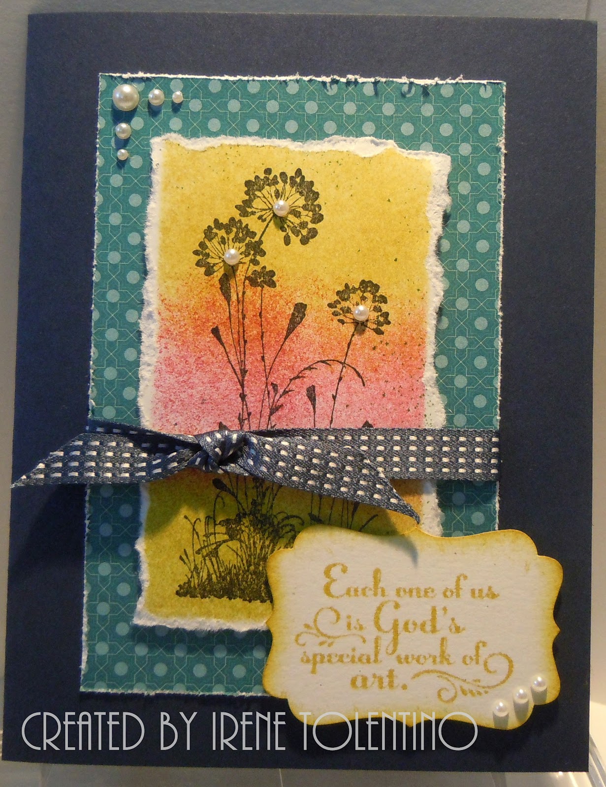
On this card I used the focal point I messed up when I was working on the first card.  I sponged out of the mask so ink was all over my card.  The solution, tear the sides and do a different layout!  The card base is Midnight Muse (blue) and I like it with Summer Starfruit (yellow).  The printed blue panel is from the designer paper stack called Festival of Prints.


On this card I used another image from the Serene Silhouette set.  I stamped the image directly on the printed paper, also from Festival of Print paper stack, with midnight muse ink.  Love that paper, just had to use it.  The rhinestones were colored with navy blue sharpie.


This is the same as the previous card except I used Early Espresso for the card base and added butterflies for embellishments.  Again, I used the white butterflies already die cut and this time colored them with midnight muse ink.  I really like how this one turned out.


This is the clean and simple one.  No sponging!!! I really like midnight muse and summer starfruit together.  Who would have thought I would use so much blue ribbons.  The Stampin'Up promotion in September was free ribbon spool for every forty dollar purchase and that's the only reason I have midnight muse ribbon.  And I found I really like that color.


Here's the group shot!  You always need a group shot.


This is how I packaged them.  A simple clear box with a ribbon and tag.  All six cards and envelopes fit in the box.

All supplies are from Stampin'Up except for the clear box.

Cheers!